To meet the changing needs of the recycling system, the How2Recycle team has been hard at work in collaboration with The Sustainable Packaging Coalition’s Packaging Design Collaborative to refresh our label.
Now, we’re excited to share that we’ve wrapped our second round of consumer testing designs for the refreshed How2Recycle label—but first: Why are we refreshing the label design? And why are we doing it now? To learn more about the case behind our consumer research, check out our findings from our first round of consumer testing.
In this article, we’ll unpack learnings from our latest round of consumer testing. In this round, we surveyed 1,000 consumers across the U.S. to dive deeper into understanding the equity in the current How2Recycle label, the symbols that resonate with consumers and comply with legislation, and the verbiage that instills understanding and inspires action.
Check out the four biggest takeaways from the latest round of consumer testing the How2Recycle label.
Takeaways from Testing the How2Recycle Label Refresh with 1,000 Consumers
People Wanted to See Recycling Referenced
In this round of testing, we learned that consumers wanted to see references to recycling, no matter the material’s recyclability category. For example, right now the Check Locally labels issued for materials that are only recyclable in some communities say just that: “Check Locally.” In this round of testing, consumers wanted to see some form of the word “recycle” and preferred verbiage like “Contact local recycler.”
People Liked Bold, Contained Design
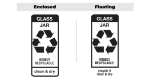
Caption: Consumers preferred designs where all label components were contained within the rounded rectangle.
When we tested several different designs, we found that consumers preferred bold but contained designs, meaning they wanted to see every element of the How2Recycle label as congruent and contained within the rounded rectangle. Respondents both preferred this set up from a design perspective, but 75% of respondents agreed that it also captured their attention faster. A majority of respondents also showed a preference for bold, fully capitalized copy within the tile.
People Preferred Informative Language for Disposal Directions
In the last round of testing, we saw preference for written instructions. This round of testing substantiated and expanded on that insight, as we saw consumers gravitate toward informative language that clearly—chronologically—told them what to do. For example, consumers preferred “Clean & recycle” over the current “Recycle if Clean & Dry.” We saw this trend—consumers’ preference for outlining their steps, in order—across several of the directions we tested.
The Brand Equity in the Recycling Symbol Remained Strong
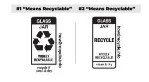
When asked “Which of these means recyclable to you?” respondents favored the existing chasing arrows symbol.
In our first round of testing, we saw that people recognize and prefer the chasing arrows symbol. In this round of testing, we saw that insight further substantiated. Respondents presented with a series of symbols and the word “RECYCLE” in tiles were asked, “Which of these means recyclable to you?” The winner was the existing chasing arrows symbol, with the word “RECYCLE” in second place, and the symbol that most closely mimics the chasing arrows in third.
What’s Next for the Label Refresh?
Having sampled more than 1,800 consumers, we’ll take our findings from these first two rounds and refine our designs. With EPR compliance and label laws in mind, we’ll also be sure to consult relevant legislative and regulatory bodies, continue using the FTC’s Green Guides, and present our progress to members at the How2Recycle Summit this October 2 – 3 in Chicago. If you haven’t already, How2Recycle members can register here to attend. And if you’re interested in becoming a How2Recycle member, you can sign up here.

